
Understanding the Role of Visual Marketing in the Beauty Industry
The impact of first impressions for beauty businesses
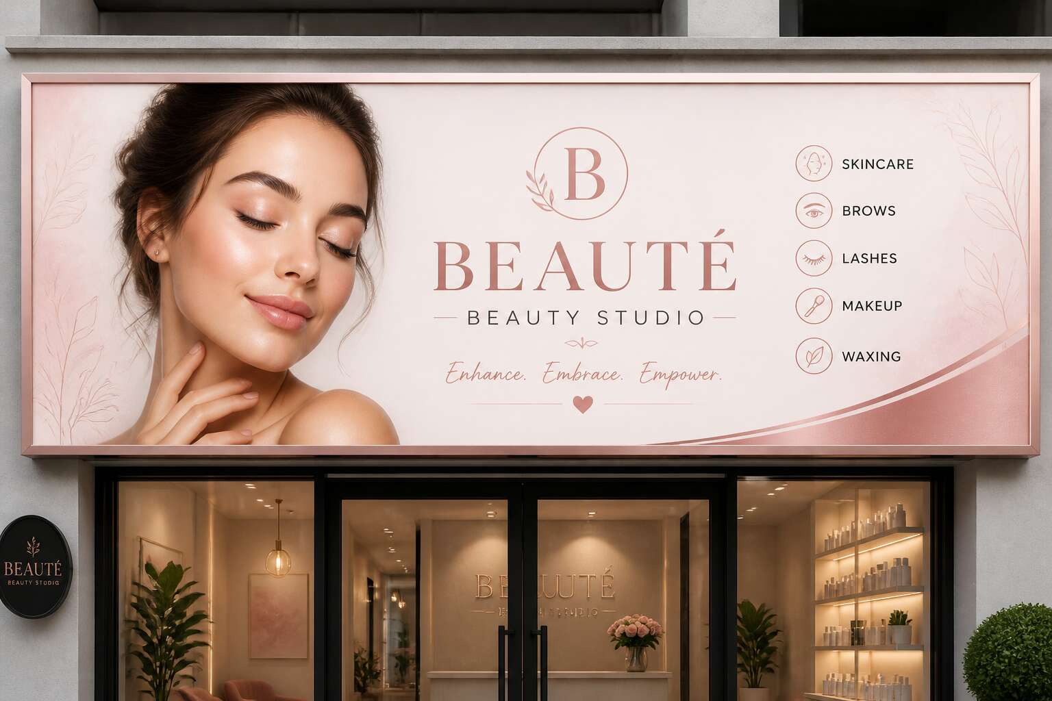
People form a visual judgment about a beauty business in roughly 50 milliseconds. That glance decides if a client steps in or scrolls past. For salons and spas, the beautician banner provides that critical first visual cue. The psychology is straightforward: humans process images faster than text, and they assign quality based on what they see first.
First impressions are not abstract. They shape trust and perceived competence before a single word is spoken. A beautician banner serves as a direct representation of the business. It communicates professionalism and skill through color, typography, and imagery. A blurred print or faded palette diminishes credibility instantly. Conversely, a crisp banner with strong contrast catches attention from a moving car, which matters for businesses competing on South African streets.
Visual marketing functions as a communication tool that sets client expectations. Clients interpret colors and fonts as signals of hygiene, creativity, and reliability.
Why professional signage matters for salons and spas
Research shows that 62% of consumers visit a business based on its exterior signage. For South African salons and spas, the beautician banner serves as the first piece of brand communication. Visual marketing in this sector connects the storefront to the service experience. It sets a quiet expectation before the door opens.
Professional signage matters because it translates hygiene and expertise into visible cues. A well executed beautician banner uses consistent colours, clean typography, and durable materials. I have watched clients walk past faded boards, assuming the care inside matched the neglect outside.
- Consistent branding across all touchpoints
- Legible text from a moving car
- Weather resistant materials for outdoor use
That investment in the physical sign signals attention to detail. In a crowded market, those signals carry weight.
How banners bridge online and offline branding
A beautician banner is the physical counterpart to a salon’s Instagram feed. A client scrolls through a stylist’s work online, then drives past the shop to compare the real world against the digital promise. Visual marketing lives in that moment of comparison.
In South Africa, data costs and load shedding shape online behaviour. The offline touchpoint carries weight. A legible beautician banner uses the same colours, typography, and tone as the brand’s social pages. It signals consistency without a single click.
This is how a brand becomes familiar:
- The same logo appears in stories and on the street.
- The same specials are advertised in both spaces.
- The same design language repeats across screens and signage.
The banner acts as verification. It confirms what the screen promised, and that confirmation builds quiet trust.
Essential Design Principles for High-Impact Beauty Signage
Color psychology for beauty and wellness brands
Sixty percent of snap judgments occur in ninety seconds, and your beautician banner is the mute employee shouting from the curb. Color does the heavy lifting before a single word registers. In South Africa’s fierce sunlight, pale pastels wash out like yesterday’s gossip; saturated hues hold their ground. We hire colors for their temperament, not their popularity.
Consider the psychological payload:
- Deep magenta whispers indulgence, not panic.
- Teal suggests clinical calm, ideal for a dermatology add-on.
- Bold orange demands attention, but overuse reads as a clearance sale.
Your banner’s palette either aligns with your brand’s promise or sabotages it. A luxury facial studio cannot survive on neon yellow, no matter how trendy. Pick two dominant tones and one accent, then test them at five metres in midday glare. That is the real colour theory for your business.
Typography choices that convey elegance and professionalism
A serif face on your beautician banner summons permanence. Sans-serif banishes clutter for contemporary spas. Neither matters if your letters cannot be read. In Cape Town’s coastal light, thin strokes fade. Thick, balanced forms hold. Legibility must come first!
- Pair one display serif with one neutral sans-serif.
- Set kerning manually for premium names.
- Leave generous line spacing for contact details.
Tight letter spacing reads as carelessness. A banner with cramped capitals fails to impress. Restraint in letterforms prevents visual clutter. Your type should guide the eye at a glance. That measured control earns a second look.
Using high-quality imagery to showcase services
Three seconds. That is how long a passerby gives your signage before moving on. A beautician banner must prove competence instantly. One striking photograph of a finished treatment communicates more than a paragraph of promises.
Direct sunlight exposes weak printing. Glossy laminates glare and wash out detail. Choose matte finishes with photographs that hold strong contrast and true skin tones. Cape Town’s coastal light demands this attention.
Placement governs perception. The eye enters from the top left, so position your strongest image centrally. Contact details sit below, never overlapping faces or product shots. Negative space frames the work.
For multi-service studios, lead with the highest revenue service. One image beats a collage. Simplicity outperforms completeness, every time!
Effective image selection follows a pattern, and every beautician banner benefits from these choices:
- Show real work from your own studio
- Use natural light photographs
- Crop tightly to emphasise technique
- Avoid stock models with generic expressions
The result is signage that proves skill silently.
Balancing text and white space for readability
White space is not emptiness. It is the silence that lets your message speak. On a beautician banner, text fights with imagery for attention. When both compete, the eye sees neither. Start by limiting text to a headline, a service line, and contact details. White space gives each element room to breathe.
A clear hierarchy sets the order. The business name commands the top. The offer, if any, sits below. Keep line lengths short. Avoid cramming six services into one banner. Instead, feature three with generous margins.
Consider the viewing distance. Text that looks large on screen shrinks when mounted. Test legibility from five meters. For a balanced layout, follow this order:
- One focal image
- One headline of five words or less
- Contact information in a single line
White space separates these zones. Without it, the beautician banner becomes noise. With it, your message cuts through. The result is a sign that invites, not overwhelms.
Incorporating your logo and brand identity
A beautician banner is the first physical expression of your brand identity. The logo anchors the layout. Each element, from colour blocks to text placement, must support that mark. If the logo competes with decorative shapes, recognition fails. Clients should identify your business from a distance without squinting.
Establish a clear visual hierarchy. The logo occupies the primary zone. Secondary text follows in a subordinate position. Repeated exposure builds recall. Your banner should mirror the visual tone of your salon’s interior.
Simple rules prevent common errors:
- Keep the logo within a third of the banner area.
- Match the backdrop to your primary brand colour.
- Use the same font weights as your price list and cards.
A banner that reflects your stationery strengthens brand equity.
Mobile-friendly and multi-format design considerations
More than 70% of salon visits begin with a mobile search, yet many beautician banners fail on a small screen. A banner must perform across a phone, a tablet, and a physical storefront. This multi-format reality demands flexible layouts that retain legibility at every size.
Consider the viewing context. Someone scrolling on a pavement might glance for two seconds. Your banner needs a focal point that survives cropping. Test your design at reduced scales before printing!
- Use vector files for sharpness across dimensions.
- Keep critical text away from the edges.
- Select a font that holds up at half the intended size.
Adaptive design does not mean duplicating effort. I have learned that it means prioritising what matters. Your beautician banner should communicate the service and the contact detail without requiring a zoom gesture.
Strategic Placement and Usage for Maximum Visibility
Storefront banners and sidewalk signs
A sidewalk sign placed at the wrong angle is a conversation with nobody. For a beautician banner to deliver bookings, position it where foot traffic actually pauses, like near a bus stop or outside a coffee shop. The storefront banner should face the direction of approaching pedestrians, not the road. That slight tilt matters!
In South African shopping centres, high footfall zones shift by the hour. Morning rush favours entrances near parking. Lunchtime crowds drift toward food courts. You can rotate your signage accordingly. One clever salon owner I know keeps two sidewalk signs.
- Check sightlines from across the street
- Move signs clear of doorways and wheelchair ramps
Test your beautician banner from a distance of ten metres. If the phone number blurs, the placement is useless.
Event banners for bridal shows and pop-up salons
At a bridal show, a beautician banner competes with hundreds of vendors. The placement decides whether your gazebo gets traffic or gets skipped. Position the banner at eye level, angled toward the aisle flow. Most attendees walk past booths on the right side, so angle your messaging to catch that approach path.
For pop-up salons, I have seen the banner’s job change with each venue. It must do the work of a storefront, a price list, and a booking invitation in one glance. Use it to mark the entrance to your space, not decorate a wall.
- High mounting points clear the crowd and keep the banner visible above head height
- Sandbagged bases survive Cape Town’s afternoon wind during outdoor pop-ups
- Sightlines from registration desks and food stalls catch the moments when attendees pause
A bridal show attendee scans a hall in seconds. Your beautician banner answers where you are and what you offer before she looks away. That visibility window is small.
Trade show and exhibition banners for beauty brands
A trade show floor is a living organism, breathing with the shuffle of hundreds of feet. Your beautician banner must catch that pulse. Place it where the crowd naturally gathers, near demo stages or coffee stations, not at the back of your booth. The banner should face the main thoroughfare, angled thirty degrees to greet approaching visitors.
Consider the physical space you own:
– Mount the banner at the outer edge of your display, not behind a table.
– Use lighting to make the fabric glow against the hall’s harsh fluorescents.
– Keep the base clear of clutter, so the visual message remains unbroken.
I have watched exhibitors hide their beautician banner behind a pillar. That mistake costs them every passing glance. Your banner is the first voice in a noisy room, so give it room to speak.
Seasonal promotions and limited-time offers
December trade in South African salons surges from the first week of the month, when holiday prep begins. A beautician banner that announces a summer special must sit where the eye lands before the foot turns away. Within the salon, place it where clients pause:
- Near the payment counter, where decisions linger.
- In the waiting area, where eyes search for something to read.
- At the window, angled toward foot traffic.
The lifespan of a seasonal offer is short. That urgency should shape the banner’s story. Swap out generic imagery for the specific promotion. State the offer plainly, with dates visible from three metres away. A beautician banner that hides its expiry date undermines the urgency.
When the promotion shifts, shift the banner. A faded Christmas message in April tells passersby that your business has stopped paying attention. Renew the fabric, update the text. A consistent position builds quiet familiarity, as returning clients learn to check the same spot each season.
Indoor banners for service menus and promotions
Indoor banners serve a quieter purpose than their street-facing counterparts. They inform, guide, and persuade. A beautician banner positioned beside the reception desk can display the full menu of services, from gel manicures to keratin treatments, without demanding attention. Clients waiting for their appointment have time to read. They may discover a service they had not considered.
Placement matters as much as content, and I have watched salons overlook this detail! The treatment room door, the mirror near the drying station, the corridor leading to the washbasins. Each location offers a moment of pause. Consider these high-traffic indoor spots:
- Above the consultation chair, where clients sit before decisions are made
- On the back of the bathroom door, where eyes rest for minutes
- Along the staircase wall, if your salon has two levels
A beautician banner that lists services and prices saves your staff from repeating themselves. It answers questions before they are asked.
Material Selection and Durability for Indoor and Outdoor Use
Vinyl vs. fabric banner materials
South African weather subjects outdoor signage to intense UV, dust, and sudden storms. A beautician banner must survive these conditions while maintaining its polish. Vinyl is the workhorse for outdoors, with waterproof layers and tear resistant edges. Fabric, by contrast, suits indoor settings where temperature stays controlled.
When picking material, evaluate these elements:
- Vinyl withstands rain and humidity without warping.
- Fabric resists creases and catches light softly in a salon.
- UV coated vinyl holds colour for months in direct sun.
- Fabric needs protected spaces to avoid mildew.
The right choice depends on placement. A beautician banner mounted outside demands vinyl for its weatherproof durability. Inside, fabric elevates the room with a woven finish. Both materials can last years, but vinyl loses flexibility in harsh sunlight while fabric maintains its form in climate controlled interiors.
Weather-resistant options for outdoor display
A beautician banner mounted outdoors faces a daily gauntlet of ultraviolet rays, dust storms, and sudden Highveld downpours. The Cape Doctor wind can batter a flimsy sign into submission within a week. Weather-resistant options for outdoor display begin with the substrate itself.
These features separate a lasting banner from a disposable one:
– Heavyweight PVC (at least 440gsm) with a UV inhibitor
– Heat-sealed hems instead of stitched edges
– Brass or stainless steel eyelets at 30cm intervals
These specifications matter. A banner that strains against its ties needs structural reinforcement, while decorative ink does little to keep it intact. Outdoor signage should use solvent-based inks that bond with the vinyl rather than sitting on top. The result is a beautician banner that survives an entire promotional cycle, from season launch to closing sale, without losing colour or clarity.
Finishing options: hemming, grommets, and pole pockets
Choosing the right material for a beautician banner depends on its lifespan and location. Indoor banners can use lighter PVC or fabric. Outdoor banners demand a heavier substrate, often 440gsm or higher, to withstand sun and wind without curling.
Finishing options determine how the banner mounts. Hemming reinforces edges with a heat-sealed fold. Grommets offer tie points for walls or frames. Pole pockets slide over upright poles for a flush appearance. Match the finish to the installation site.
- Heat-sealed hems
- Brass grommets
- Pole pockets
I always assess the mounting surface before ordering! A pole-stretched banner needs grommets, while a fixed frame suits pole pockets. The right material and finish keep your beautician banner sharp from first glance to final day.
Eco-friendly and sustainable banner materials
Most salon owners replace their beautician banner twice a year. The repeated cost adds up, and discarded banners pile into landfill. I check the substrate’s lifespan before recommending anything.
Outdoor exposure breaks down standard PVC within a season. A heavier grade with UV inhibitors lasts far longer under South African sun. Indoor placements suit lighter recycled fabric, which prints crisply and folds flat for storage. Sustainability now drives material choice. Recycled PVC and PET textiles hold up well, and some suppliers collect used banners for repurposing.
- Recycled PVC for high-traffic outdoor display
- PET fabric for indoor menus and counter signs
- Bio-based substrates for short-run events
Each option shifts how long the banner stays sharp. That decision affects your budget and your waste footprint.
Cost vs. longevity considerations
The first question I ask any salon owner is where the banner will live. A beautician banner placed indoors faces gentle conditions, but the outdoor environment punishes cheap material quickly. Direct sunlight, wind, and temperature swings break down standard PVC within a season. That is why I check the substrate’s exposure rating before I recommend anything. Heavier grade vinyl with UV inhibitors holds its colour under the South African sun far longer than budget options.
The cost calculation changes when you factor in replacement frequency. A cheaper beautician banner might save money on the first print, but if it fades or tears after two months, you are paying for labour, installation, and removal all over again. Meanwhile, a durable outdoor banner sits sharp for months, giving you far more impressions per rand. For indoor use, recycled fabric works well because it prints crisply and folds flat for storage. You can swap it seasonally without feeling wasteful.
The environmental angle matters too. Recycled PVC and PET textiles handle high traffic areas well, and some suppliers collect used banners for repurposing. Bio-based substrates suit short run events where longevity is less critical. Here is what I weigh:
– Cost per week of active display
– Fading resistance in direct sunlight
– Waste disposal fees for repeated replacements
– Storage practicality between uses
Every material shifts how long the banner stays sharp. That decision affects your budget and your waste footprint, so I always ask for real-world exposure data before committing. A beautician banner should outlast the promotion, not the other way around.
Measuring the Effectiveness of Your Beauty Brand Advertising
Tracking foot traffic and QR code engagement
Your beautician banner could win awards for aesthetic brilliance while your appointment book stays empty. That is why measuring foot traffic matters more than artistic pride. Track daily visitors for two weeks before hanging the banner, then for two weeks after. The difference tells you if the design works or merely decorates.
QR codes offer a second layer of evidence. Place one on the beautician banner, link it to a mobile booking page, and observe scan frequency. Each scan is a small confession of interest. You can see which days, which locations, and which offers capture attention. This data beats guessing, and it costs nothing beyond the code itself.
Using unique promo codes on printed banners
One missed booking costs more than a banner ever will. That is why your beautician banner should carry a unique promo code instead of a plain phone number. A code like “GLOW10” tells you exactly who saw the banner and acted on it.
Print the code on the banner and link it to your booking system. Every redemption becomes a data point. You can see which location, which week, and which offer actually moved clients. No guesswork, no pride, just numbers!
Track these metrics:
- Redemption rate by week
- New clients versus returning clients
- Average spend per redeemed code
That data turns a pretty banner into a measurable asset. You will know if the design deserves another print run or a complete rethink.
A/B testing different banner designs
Half the beauty industry operates on hopeful guesses, but A/B testing your beautician banner removes the guesswork. Print two versions. Version A with bold serif typography, version B with pastel gradients. Then watch the bookings flow. A simple tracking method like QR codes or separate promo codes per design reveals which version performs better.
This banner provides a controlled comparison. Testing one variable at a time, layout, wording, or image size, keeps the rest identical. After two weeks, compare the numbers.
Choose a clear winner based on:
- response rate
- cost per lead
- client quality
The losing design gets rotated to a secondary location or scrapped entirely.
Gathering customer feedback on visual appeal
A 2023 survey found 76% of new clients notice a business through its storefront signage. Yet most owners never collect feedback on that impression. When I evaluate advertising for beauty brands in Cape Town, I ask: how do people describe your beautician banner in their own words?
Gathering qualitative customer feedback on visual appeal requires deliberate effort. Place a tablet at the reception desk with three quick prompts. Ask clients to rate the banner’s attractiveness and write one adjective that comes to mind. Alternatively, use staff to casually ask customers what drew them inside.
- Observe where people look when passing by
- Note which days bring more inquiries after a banner change
The feedback becomes a measurable asset. Specific phrases reveal whether your beautician banner aligns with service quality. Track responses alongside booking data to see which visual elements drive outcomes.
Updating your banner strategy based on data
Data only matters when it changes your next move. After collecting client impressions and tracking foot traffic, compare those numbers against the banner’s actual lifespan. A banner that performs well for three months might lose its impact by the sixth.
I review booking sources weekly. If inquiries spike after a new installation, the design elements that coincided with that shift become visible. When a downturn appears, the question is whether your beautician banner has become invisible against surrounding storefronts!
- Client feedback phrases vs staff observations
- Banner changes mapped to booking patterns
- Service categories that draw new clients
Updating your banner strategy follows the evidence. Replacing underperforming visuals matters more than redesigning everything. South African beauty markets shift with seasons, so a beautician banner aligned with local events like wedding expos or summer skin care campaigns carries more weight. The data separates what to keep from what to retire!
0 Comments